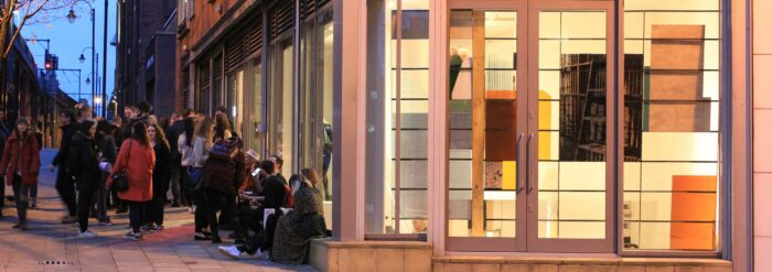
‘Night & Day: Comic Rationalism’ – John Gledhill
‘Night & Day: Comic Rationalism’ – John Gledhill
22 February 1990 - 28 March 1990
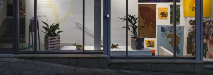
In these post modernist times it is perhaps only with tongue in cheek that one can label one’s work with any other ‘-ism’, especially one which could be translated into mock seriousness. Yet John Gledhill’s use of the term ’comic rationalism’ really does have a serious point. Suggested in the first instance by analogy with ‘Comic Iconoclasm’, the title of a recent exhibition which explored various subversive uses of comic book style and imagery in contemporary art, it is a way of saying that such a style, which deliberately limits itself, at least initially, to outline drawing and primary colour, can in fact be adopted without irony or subversive intent. Nor does John Gledhill make the kind of knowing reference to sources or antecedents – Krazy Kat or Mickey mouse- characteristic of the comic iconoclasts. The tone of his work is matter-of-fact, deadpan, even naïve. If it recalls anything, it is not actually comics at al, but the lids of the boxes toys and model kits are packaged in- influences he is happy enough to acknowledge.
For the child who plays with the toy trains or builds a model ship from a plastic kit the world of imagination is self-sufficient. There is no ‘message’ in it, something similar underlies the rationalist side of the Gledhill equation. Rationalism here is not particularly a comment on the world so much as ‘merely’ a way of making what he sees as ‘good’ that is well made paintings. To make such an insistence on craftsmanship may, ironically, be seen in some quarters as comic, especially when it lies behind such modest appearances, frankly “handmade” as he puts it, not ostentatiously the products of some smoothly accomplished technique. Nonetheless, these paintings do have a perfectly logical artistic pedigree, and a rationale.
John Gledhill something of a latecomer to paintings, having originally studied English and philosophy at university. Often perhaps because they have had to justify to themselves their change of direction, mature students develop a more self-consciously thought out approach to their work than their younger contemporaries. As a student John Gledhill became fascinated by colour theory, particularly in the relationships of the three primary colours, red, yellow and blue. By contrast, much of his time was spent in the life room, where the emphasis was on figure construction using tones. Pure colour made an incidental appearance, ”only if the model happened to have a red backcloth, or something…”. Frustrated by this, yet persuaded by the example of Frank Auerbach and Leon Kossoff that the figure was what he ought to concentrate upon, he began to take an interest in urban landscape and incident. The challenge, for him , was however to find a way of exploiting the full impact of complementary colour, and to use colour to give another dimension to his work apart from that of the material description.
One of his earliest response to this challenge is a painting of Manchester High Street made shortly after the move to that city in 1985. Despite its name, this is no main thoroughfare, but a rather insignificant side street running past the behemoth that is the Arndale Shopping Centre towards Manchester’s garment district. The painting despite its garish colours, is literally streets away from those of the fauves, those ‘wild beasts’ who introduced the idea of startling colour combinations into modern art – to whom John Gledhill might perhaps of been expected to look for a starting point. Far from reflecting light, colour here seems to absorb it. With its distant raised perspective and stiff clumps of figures and static looking vehicles, it looks deliberately assembled, like some alienated Lego land , ‘catching the tawdry, desultory character of the area rather well. Contributing heavily to this assembled quality is the device that has as yet become a Gledhill trademark – the black outline. This is, in fact, no more than a simple way of indicating that one thing is behind another when using flat unmodulated colour – except that Gledhill knows as well as anybody that nothing is ever a formal device. Another painting from around this time shows the view from his studio window, and is virtually an exercise in seeing how many black outlined objects he could cram into a small space and still keep the painting legible. Later, in the ship paintings, he introduces quiet little jokes like having the outline of a small white-sailed dinghy just cut into the huge black hull of a liner (and does a black object, incidentally, have a black outline?).
The ship paintings are notable also for a rather weightier visual joke, and for the greater immediacy that comes into the work as its corollary. The hulls of the liners begin to be turned towards the onlooker, in a linear perspective that is more and more exaggerated at odds with the flat picture box primaries of sky and sea. As the eye rushes along the sides of these monstrous vessels towards a vanishing point that is ever more precipitate, their sharp black bows seem almost to loom out of the picture plane. The fact that they very nearly fill the canvasses in the first place reinforces the joke. On a more serious level – the night side, perhaps of his character- this uncompromising immediacy has been carried over into such recent works as “Saturday Night” and “Jacob Wrestling The Angel”. In the former, both artist and spectator confront a boozy urban crowd intent on having a good time – we can no longer feel detached, as we did with the earlier street scene; we have to come down to their level. In the Biblical picture, we are shoulder to shoulder with the struggling pair – an earlier version of the same theme, a tiny picture, shows them as manikins with disproportionately large heads that dominate, the psychological drama that is important. Both these larger paintings are night scenes, as it happens, and in both light from the street-lamps and shop-windows in the one, from a strategically placed fire in the other. In both, comic rationalism is beginning to transcend itself.